Brand Identity / Print / Packaging
Essential Macaroni
Essential Macaroni is a playful branding project built around expressive typography, clean structure, and a warm, approachable visual tone. The goal was to create a pasta brand that feels fun and distinctive while still polished and cohesive across print and packaging.
Client
Self-Initiated
Deliverables
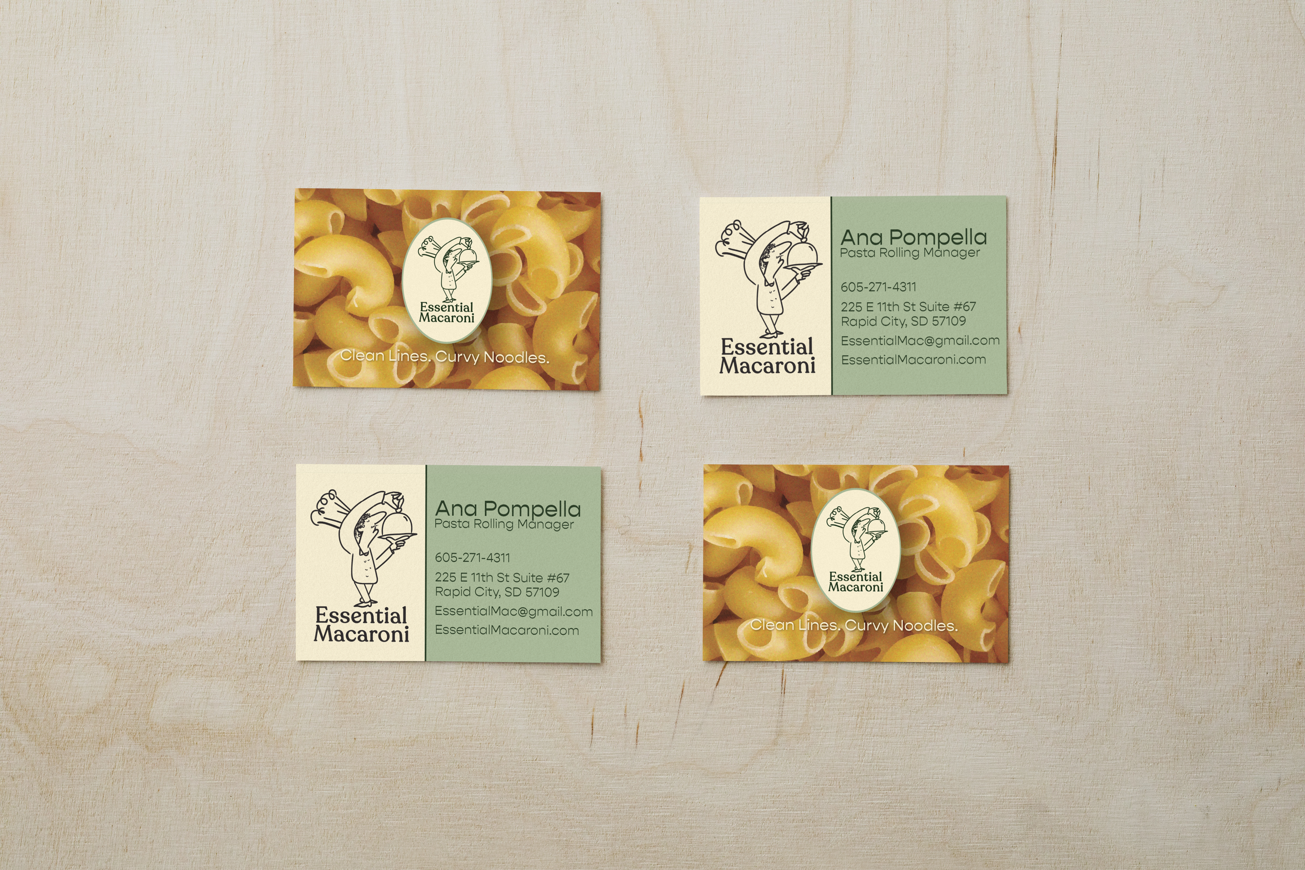
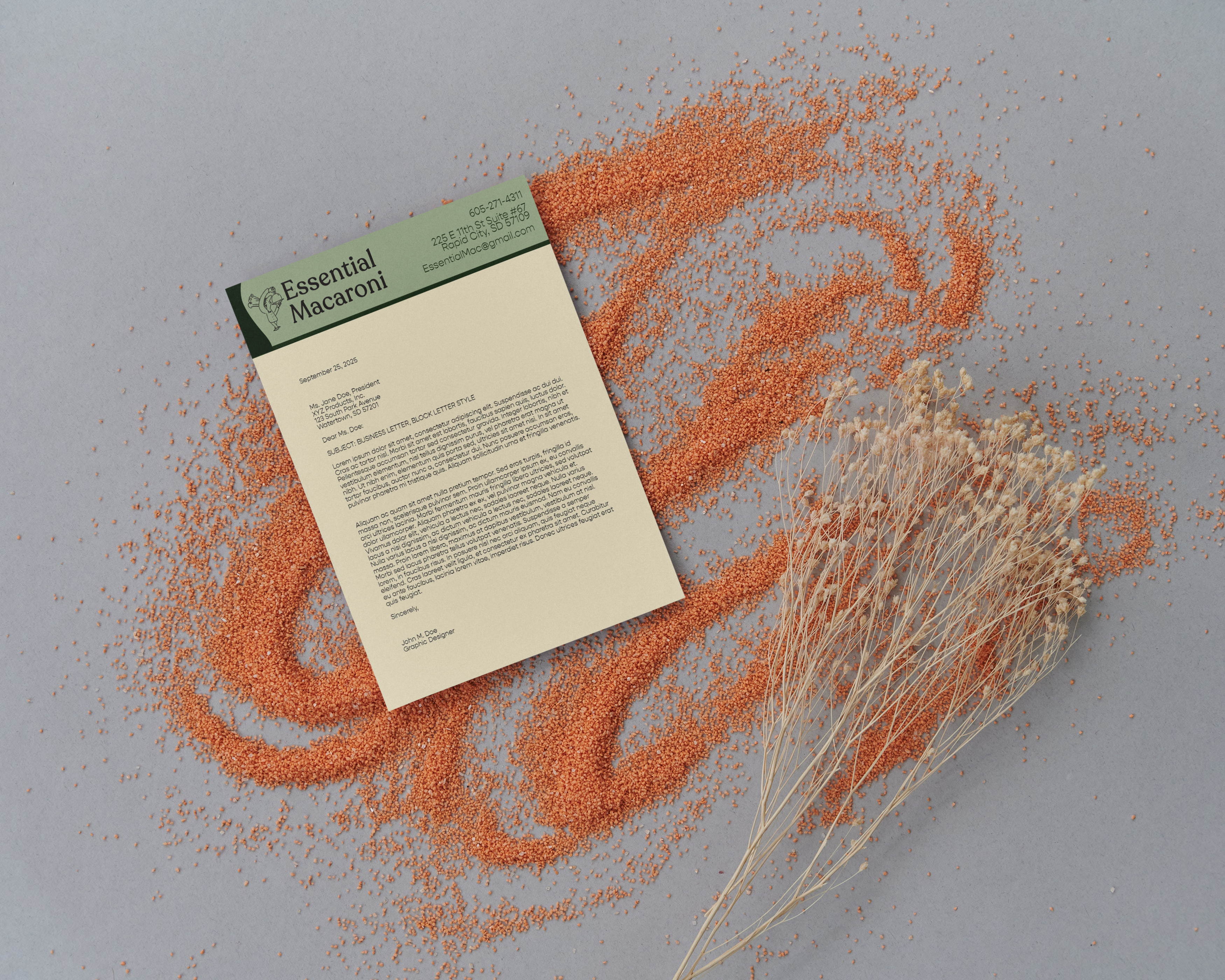
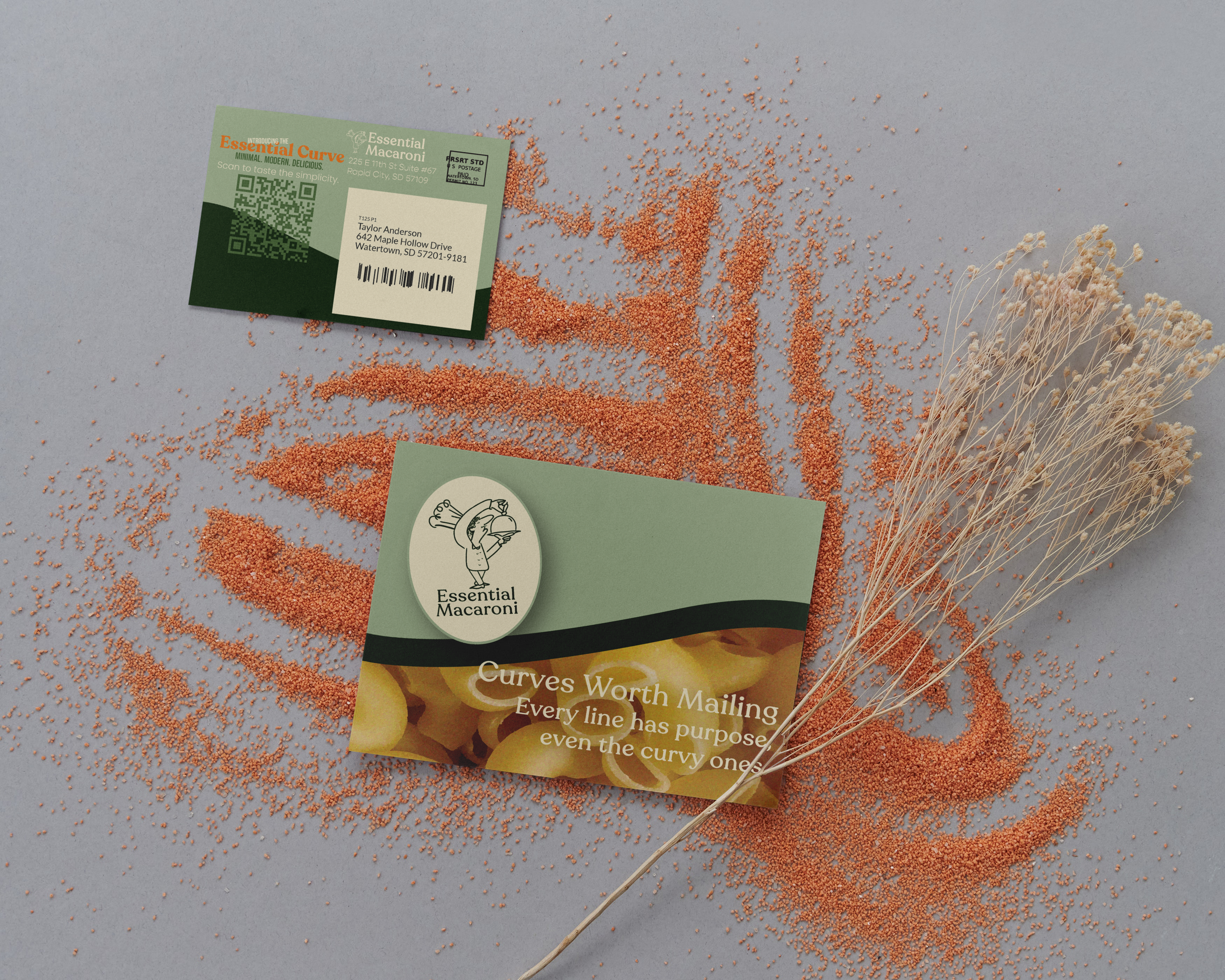
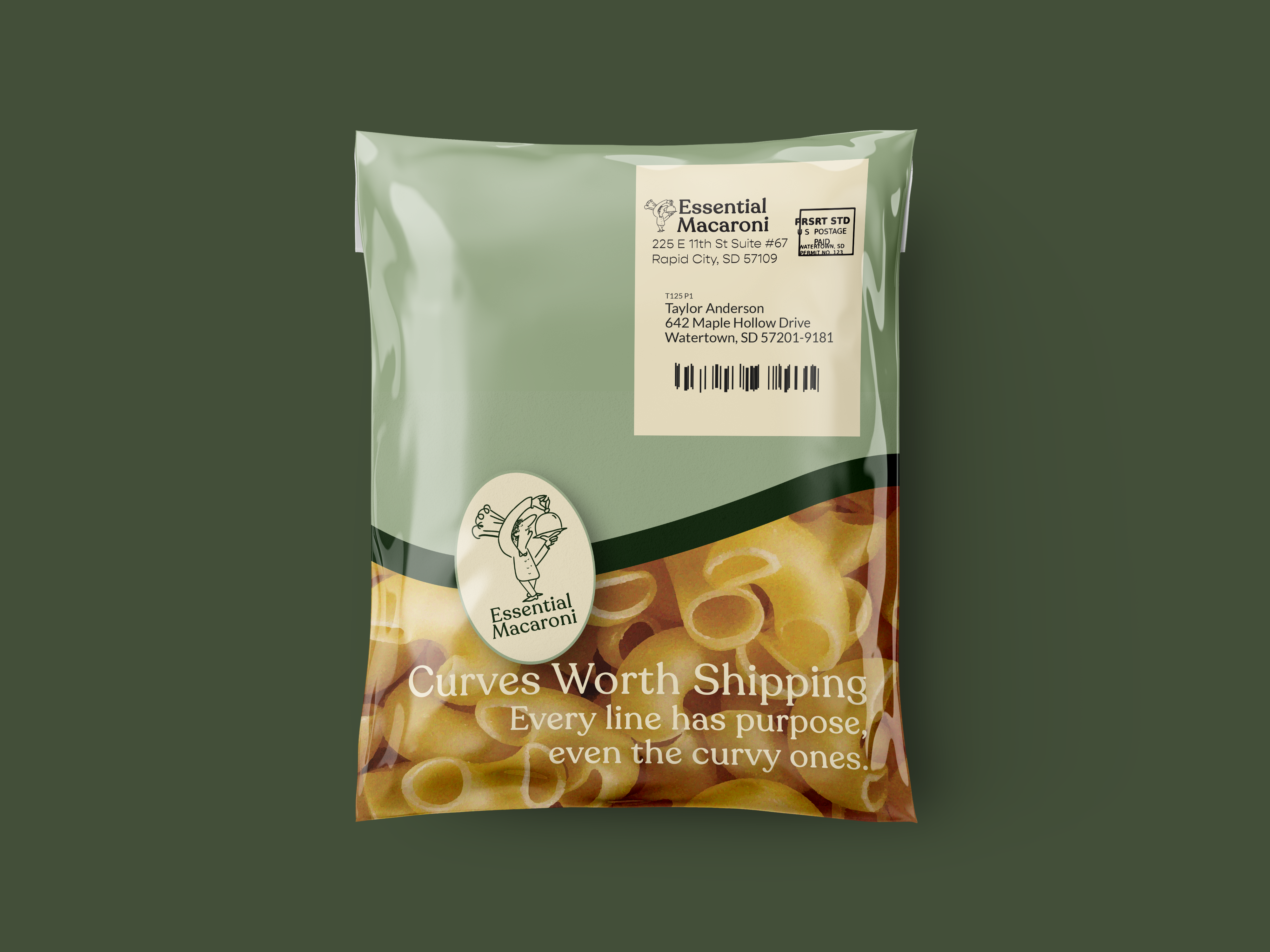
Business Card, Direct Mailing, Letterhead, Parcel Bag
Tools
Illustrator, Photoshop
Timeline
Fall 2025 (1 Week)
The Goal
Creating a pasta brand with personality and clarity
The goal of Essential Macaroni was to create a visual identity that feels playful, memorable, and easy to recognize. The design needed to combine bold personality with a clean layout system so the brand could feel expressive without becoming messy or overly complicated.
Visual Direction
Bold typography, warmth, and playful refinement
The visual system for Essential Macaroni centers around strong typography, warm color, and a clean print-driven layout. The identity balances playful energy with refined structure, allowing the brand to feel lively and expressive while still cohesive across collateral. Negative space, hierarchy, and simple compositions help keep the work polished and easy to navigate.
Reflection
What I learned through this project
This project helped strengthen my approach to playful branding and taught me how to balance expressive visual ideas with a more controlled layout system. It reinforced how much typography and hierarchy can shape the tone of a brand, especially when working across multiple print applications.