Deliverables: Logo design, packaging system, color palette, typography, brand visuals
Tools: Adobe Illustrator, Photoshop
The Challenge
Essential Macaroni needed a brand identity that stood out in a crowded grocery aisle while still feeling approachable, modern, and comforting. The challenge was to balance bold visual impact with a friendly, everyday tone that appeals to a wide consumer audience.
The Concept
The brand was built around the idea of elevated comfort food. Bold typography, playful color choices, and clean layouts were used to create strong shelf presence while keeping the brand warm and familiar.
Design priorities included:
- High visual contrast for shelf visibility
- A clear, recognizable logo system
- A tone that feels fun without becoming childish
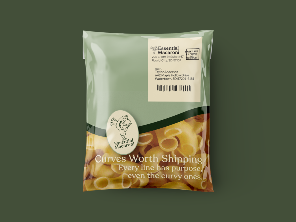
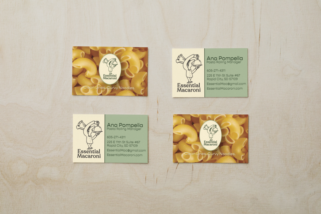
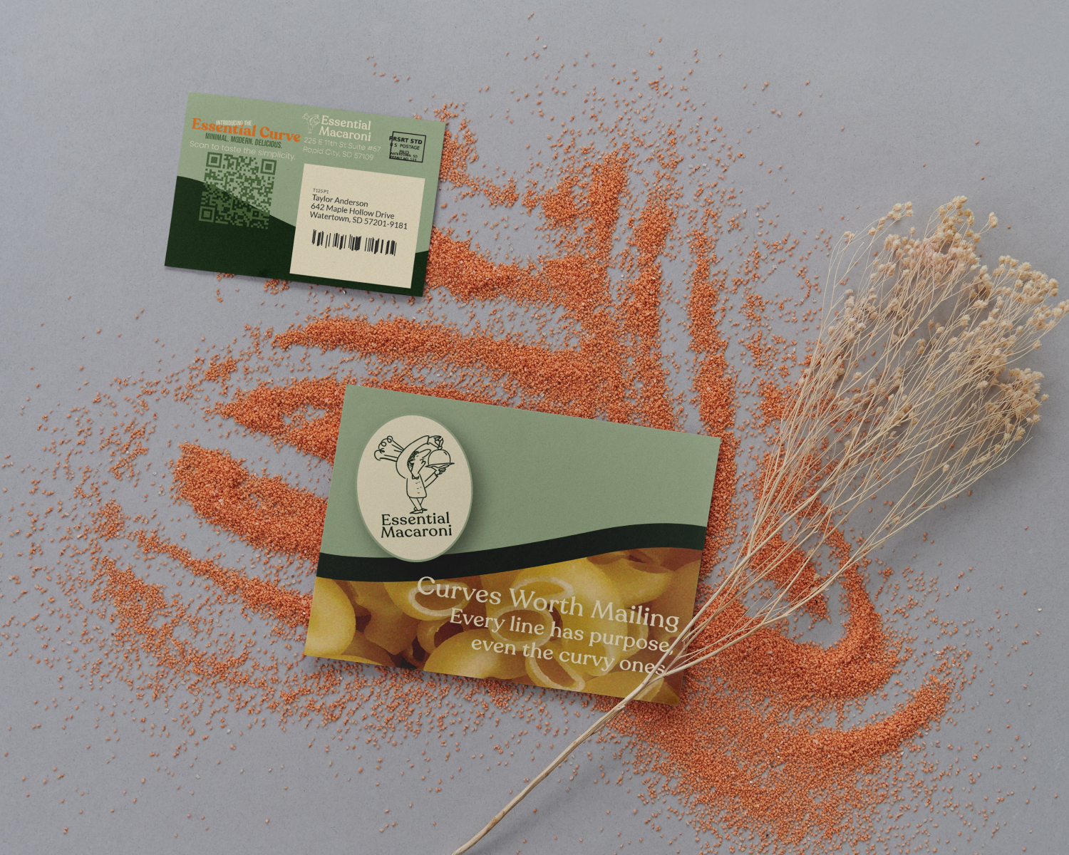
Branding & Packaging
The packaging system was designed for consistency across multiple product types while remaining flexible. Strong typography and simplified graphics help the product stand out at a distance, while close-up details reinforce quality and brand personality.
The visual system supports both physical packaging and digital marketing, allowing the brand to scale seamlessly.
Outcome
The final branding package positions Essential Macaroni as a confident, consumer-friendly brand with strong shelf appeal. This project showcases my ability to design market-ready packaging that blends strategy, personality, and clarity.