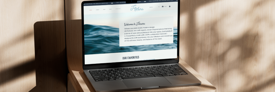
Deliverables: Logo system, color palette, typography, brand guidelines, Wix website, packaging, 15 second adTools: Wix, Adobe Illustrator, Adobe Photoshop, Adobe Premiere Pro, Adobe After Effects The Challenge Finaura needed a brand identity that felt modern, refined, and trustworthy while remaining approachable. The goal was to balance a premium aesthetic with clarity and warmth, creating a visual system that could grow with the brand. The Concept The identity is built around quiet confidence. Instead of relying on heavy ornamentation, the brand uses clean typography, intentional spacing, and a restrained color palette to communicate sophistication and professionalism. Design goals included: Visual Identity The logo system was designed for versatility across digital and print applications. Typography reinforces a refined, editorial feel while remaining highly readable. A muted color palette supports the brand’s elegant tone and ensures visual consistency across platforms. Outcome The final branding solution positions Finaura as a confident, modern brand with a cohesive visual language. This project demonstrates my ability to create strategic brand systems that extend beyond a single logo and support long-term growth.
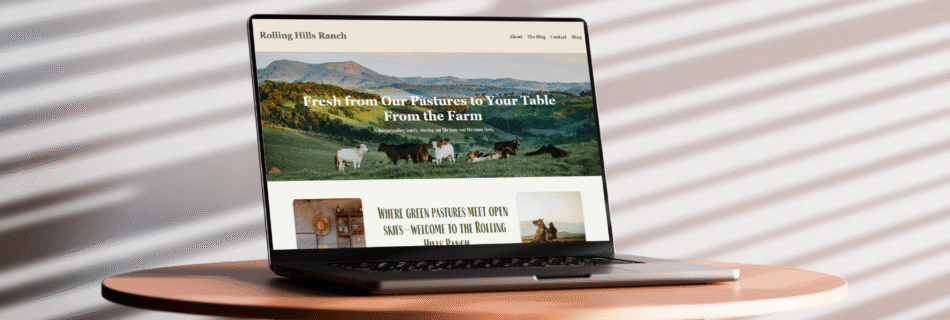
Deliverables: Website design, layout structure, visual directionTools: VS Code, HTML, CSS, JavaScript The Challenge Rolling Hills Ranch needed a website that clearly communicated their cattle and farming operation while feeling authentic and easy to navigate. The existing presence lacked structure and clarity, making it difficult for visitors to quickly understand who they are and what they do. The goal was to create a site that felt grounded, trustworthy, and straightforward, without overcomplicating the experience. The Concept The website was designed to reflect the ranch’s values: honesty, hard work, and reliability. A clean layout, strong imagery, and simple navigation were used to keep the focus on the ranch itself rather than unnecessary visual noise. Key priorities: Design & UX The design emphasizes large imagery, neutral colors, and readable typography to create a calm, approachable experience. Navigation was simplified so users can quickly access key information without friction, whether browsing on desktop or mobile. Outcome The final website presents Rolling Hills Ranch as a professional and credible agricultural operation with a clear digital presence. This project highlights my ability to translate real-world businesses into functional, user-friendly web experiences that prioritize clarity and trust.
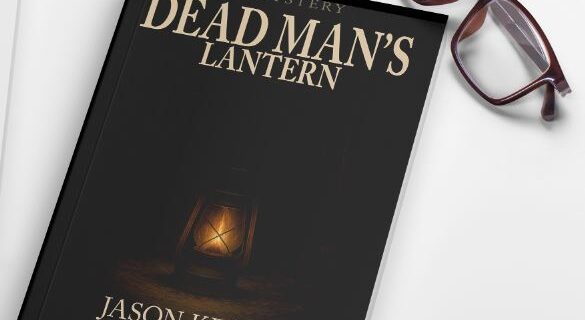
Deliverables: Front cover designTools: Adobe Photoshop The Challenge The goal was to design a book cover that immediately communicates mystery and tension while clearly signaling the genre. The cover needed to draw readers in visually and hint at the story’s darker themes without revealing too much. The Concept The design centers on atmosphere and symbolism. A limited color palette, dramatic lighting, and strong contrast were used to create a sense of unease and intrigue. The lantern acts as a focal point and metaphor, guiding the viewer’s eye while reinforcing the narrative tone. Key considerations: Design Execution Typography was carefully selected to feel bold yet restrained, allowing the imagery to carry the emotional weight of the cover. Composition and negative space were used to create balance while maintaining a sense of suspense. Outcome The final cover delivers a striking, narrative-driven design that captures the tone of the story and stands out visually. This project highlights my ability to use design to convey emotion, mood, and storytelling, making it a strong conceptual piece within my portfolio.
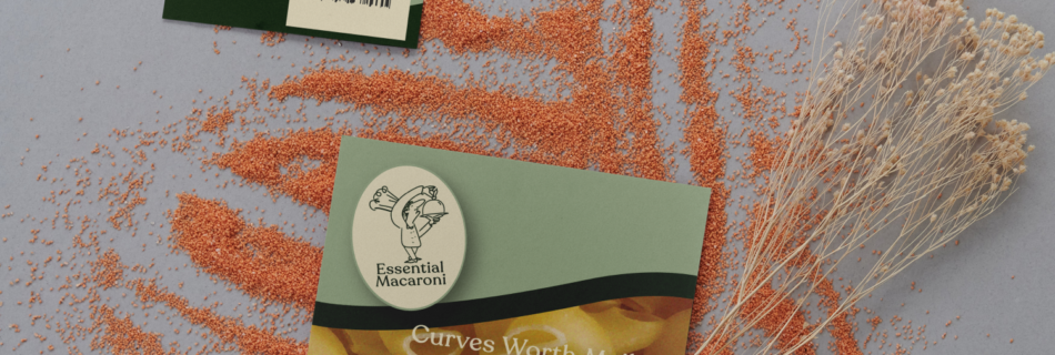
Deliverables: Logo design, packaging system, color palette, typography, brand visualsTools: Adobe Illustrator, Photoshop The Challenge Essential Macaroni needed a brand identity that stood out in a crowded grocery aisle while still feeling approachable, modern, and comforting. The challenge was to balance bold visual impact with a friendly, everyday tone that appeals to a wide consumer audience. The Concept The brand was built around the idea of elevated comfort food. Bold typography, playful color choices, and clean layouts were used to create strong shelf presence while keeping the brand warm and familiar. Design priorities included: Branding & Packaging The packaging system was designed for consistency across multiple product types while remaining flexible. Strong typography and simplified graphics help the product stand out at a distance, while close-up details reinforce quality and brand personality. The visual system supports both physical packaging and digital marketing, allowing the brand to scale seamlessly. Outcome The final branding package positions Essential Macaroni as a confident, consumer-friendly brand with strong shelf appeal. This project showcases my ability to design market-ready packaging that blends strategy, personality, and clarity.
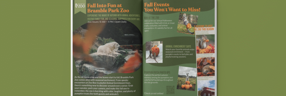
Deliverables: Campaign visuals, posters, social media graphics, promotional materialsTools: Adobe Illustrator, Photoshop The Challenge Bramble Park Zoo needed a seasonal marketing campaign that would capture attention, increase engagement, and attract families and local visitors. The campaign had to feel playful and educational while staying consistent with the zoo’s established brand. The Concept The campaign was designed to turn a season into an experience, using bold visuals and cohesive messaging across multiple platforms. Bright colors, engaging imagery, and clear calls-to-action were used to create excitement while remaining accessible to a wide audience. Key goals: Campaign Execution The visual system was applied across posters, social media, and promotional materials to ensure a recognizable and unified look. Each piece was designed to work on its own while contributing to the larger campaign, reinforcing brand recognition and engagement. Outcome The final campaign delivers a cohesive and energetic visual presence that supports Bramble Park Zoo’s mission of education and community engagement. This project demonstrates my ability to design multi-platform campaigns that balance creativity, clarity, and audience appeal.